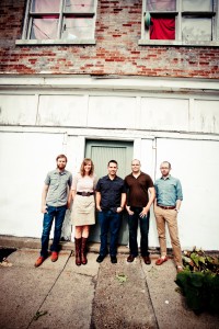
Sojourn Sunday Communications team: Michael Winters, Amanda Edmondson, Pastor Daniel Montgomery, me & Chris Bennett
If I had a dime for every time a pastor or church Communications Director complained about ugly, cumbersome, divisive church bulletins I would be rich (because I would invest those dimes in anything but the music industry).
I’ve heard horror stories of weekly staff meetings where ministry leaders compete for space on the Sunday bulletin to promote their events and volunteer needs. I’ve seen bulletins with page after page of redundant or unnecessary information:
- Name/title/phone #/email of 50+ church staff members
- Upwards of 100 upcoming events and classes
- Trivial “facts” about the pastor/member of the month
- Graphics that add clutter, not clarity
- “More info online here” URLs far too long to expect most people to type them
And more, sometimes in multiple typefaces (gotta have Comic Sans for the children’s ministry info, of course).
Our Sunday Bulletin at Sojourn is one 8.5 x 11″ page, folded down the middle to make a front & back cover and two inside pages. The front cover is reserved for liturgical art and the current sermon series logo. The art changes weekly, and fits the aesthetic of the logo. On the inside pages we print the week’s sermon Bible texts and the pastor’s brief outline (with plenty of space for guests and church members to write notes).
But today let’s talk about the back page. This is where we print the stuff that is so troublesome to many church leaders: the announcements and information. We also print an “About the cover image” artist statement, where our volunteer liturgical artists talk about their design concept. Sojourn highly values the arts. We own an art gallery and have many visual artists in our midst. We also cultivate an appreciation for the role of art in the church among all members. If this doesn’t sound appropriate for your church then your job could be even easier, because you could reserve the whole back page for announcements and info.
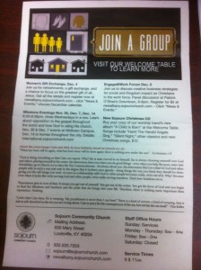
As you saw in the image above, for most of 2011 the format on our back page was:
- Banner graphic of the top thing we wanted to promote that week.
- Four short text-based ads for the four big things we were promoting.
- Artist’s Statement
- Info (address, phone #, email, Sunday service times, staff office hours)
How did we determine the “top thing”? Which of our events and opportunities to include in the four text ads? Ultimately it’s the will and vision of our Lead Pastor Daniel Montgomery, channeled through me. Our Communications Manual lists “Big, Medium, Light” promotional divisions for recurring events. “Big” things like our free health clinics and Membership classes always made the bulletin. Smaller things like ministry-specific classes often did not.
But this approach was still too text heavy. We were relying on text to sell people on the vision of each event, which is a poor choice for the back page of a church bulletin. People just need the who/what/when/where. So next we tried this:
 Much simpler, and it enabled us to include all the events coming up at each particular campus in the next month (part of this is possible because we don’t do as many events as most mega churches. It’s part of our philosophy).
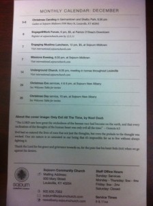
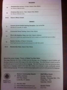
As so often happens, we didn’t see the weakness of this system till after we printed it the first week. By doing a monthly calendar, we ensured that we’d be promoting events at the end of a given month much more than events at the beginning. So the next week Media Director Chris Bennett (who designs and prints our bulletins each week) modified our Bulletin like this:
 So instead of “December events” its a rolling 30-day list.
Concurrently we redesigned our web pages, ditching the fancy-pants separate Event calendars for each campus in favor of a simple, embedded Google calendar with color coding for each campus. Now, for every event, we can simply point people to:
For info (and if needed, registration).
I love it when a plan comes together. Now we’re promoting more events than in the older model, but we’ve streamlined and simplified the design.
How do you do Sunday bulletins? Have you ditched your bulletin all together? Do you advertise all events or do you drive people to the major events? Is it a source of contention on staff, or is everyone on the same page?

{ 1 comment }
Bobby Gilles, Thanks for this! Mel & I are part of a new church plant here in Hong Kong and it would be a huge blessing to us if you could send me a/some sample layouts you guys have of front covers and back page bulletins. PDFs would be fine but .AIs would make you a stud in my eyes ;-). Cases could really use prayer in HK. Thanks for your time and help, Jason jpcase01@gmail.com Share a dropbox with me if too big.
{ 1 trackback }