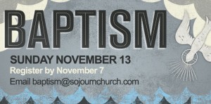
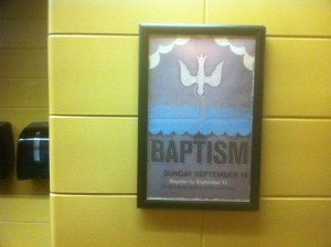
At our church Sojourn, we make a big deal about baptism. Because God does. Even Jesus insisted that John baptize him, and we all know what happened then. The Holy Spirit descended like a dove, and the Father said
“This is my Son, whom I love; with him I am well pleased.” (Matthew 3:17)
At Sojourn we hold a “Baptism Sunday” once every two months, and we continuously make people aware of the next date, through:
- Sunday stage announcements
- Sunday printed bulletins
- Weekly Email from campus pastors
- Campus website event calendars
- Weekly “Baptism Testimony” posts on TravelBlog, the official blog of Sojourn Church
- Social media
- Announcements in our community group meetings
- And our church graphic design collateral, such as web banners, posters and PowerPoint slides.
Meanwhile, our baptismal candidates write out their testimony of salvation with the help of our pastors (for more on how to write a personal testimony, click here). During Baptism Sunday, we all hear the testimonies, witness the baptisms, and we party “like its 1999,” to quote a Prince lyric.
I asked our graphic designer Bryan Patrick Todd (see his freelance work here) to write a statement about how he created the poster and web banner we use to promote our Baptism Sundays on our campus websites and in our church buildings. Don’t underestimate the importance of visual art in promoting and telling the story of God’s work through your church — some people learn and receive stimulation through visuals more so than through text.
Bryan’s statement may help you think about how to visually promote the importance of baptism at your own church, or to understand the kind of thought process that your visual artists should go through:
__________________________________________________________________
When I began sketching out a concept for the Baptism poster, I immediately thought about Matthew 3:16, and wanted to find a way to illustrate that moment without being too literal. From there, I wanted to focus on the word “baptism”, allowing it to stand out above the waves/layers of water. Behind it’s message, I wanted to let the three elements do the rest of the work:
- Big rolling clouds
- A simple & centered dove
- Water.
The last part, which sometimes takes the bulk of my time, was creating a finish/texture that set the tone. The goal was to give a sense of age, time and warmth. Make it a little more approachable. I’m extremely pleased with the result, and that it is being used at Sojourn on such important and joyful days of celebration.
— Bryan Patrick Todd

