Sojourn fleur-de-lis in reverse type (white Mark, black background). We also use it as a black Mark on white background
A logo is a graphic mark or emblem. Most people think of it as some kind of picture (a mark) but it can also be a stylized signature, or both. A logo is the visual representation of your church. Ideally, when people see it they will identify with you in a positive way. The logo will evoke feelings of your brand essence — what you’re all about.
Your Logo Must Be Simple
Keep in mind your logo must work for a variety of sizes, from tiny web thumbnails to huge outdoor signs. Test your logo:
- How does it look on an 11×17 printed poster?
- How does it look as a 16×16 pixel Flavicon? (the small icon that brand websites dispay on the left-hand side of your browser address bar when you’re on their site — or to the right of your website’s name in the tab on some browsers like Google Chrome).
Notice our My Song In The Night flavicon, which Bryan Patrick Todd designed for us. We wanted something that would convey light breaking through the darkness. The design is a black background with piercing light (possibly a star) in the middle, in the shape of the cross. Bryan did a brilliant job of encapsulating the theme of our ministry in such a small display area.
Your Logo Must Be Relevant
A logo mark doesn’t need to “say” you’re a church (You don’t necessarily need a cross, or the Christian fish, or praying hands). But it does need to say something about you. We chose the fleur-de-lis for Sojourn Community Church because it is the official mark of the city of Louisville, where we’re based. We wanted to take our stand as a church “in the city, for the city.” Our design isn’t a “stock” fleur-de-lis, and it isn’t identical to the Louisville fleur-de-lis, but it is similar enough that people in our church and in Louisville understand that we love our city.
Sojourn South Florida is a church plant we’ve supported. When they designed their logo they also wanted something that would identify them in their particular place. See how they accomplished it in the display on your right.
Some logos don’t need a mark. Maybe you just need your name in a cool logotype (think of the Kellog’s cereal logo). Sometimes churches and businesses think so hard about creating a mark that they forget their own name, distinctly rendered, might be the best visual representation.
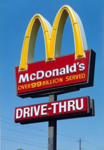
This is not to say you shouldn’t use a noticeable Christian icon (like the star/cross we used for the My Song In The Night flavicon). Just be open to all the possibilities. McDonald’s is the best-selling burger joint in the world, and their logo one of the most recognized, but it doesn’t incorporate hamburger imagery. It is simply a way of presenting the letter “M” for McDonald’s. Even without graphic representation of a hamburger, how many children (and adults) have suddenly craved a burger as soon as they saw those “golden arches” in the distance?
Although a logo should be simple, the process of creating one can be complicated. For much more information and for tons of examples, read:
Logo Design Love: a guide to creating iconic brand identities by David Airey


{ 1 trackback }